Getting prospective customers to do what you want them to do on your website is not that easy. They will call at a time when you’re on the tools, send an enquiry that never seems to arrive, and too often they won’t take any action at all! But when they do, you want to make sure that you are there ready, so it pays to know what type of call to action you want your website viewers to take.
With strong calls to action on your website and in your marketing campaigns, it’s much more likely that your customers will take action. That’s why we always ask our clients… What action do you want your website viewers to take? We’ll ask you to really think about that when working with us.
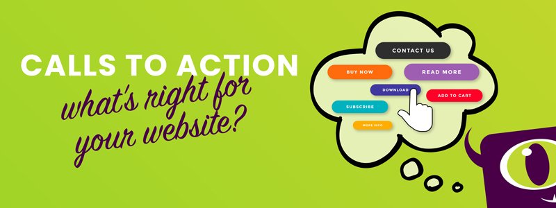
What’s a call-to-action (CTA)?
A call to action (CTA) is a marketing term for any part of a website design that prompts a next action. Your call to action is the part of your content that tells your target audience what they should do next once they hit your website or landing page. With a few short and actionable words, you tell your page viewers what to do. A simple example of a call to action on your website is “Enquire now”.
Compelling CTA’s on your website can help you urge prospective customers toward conversion. It’s important to be super clear and concise with your calls to action. If you prefer a phone call over email, say “Call us now!”. If you want them to fill out your enquiry form, say, “Email us”, and if you don’t mind either way, you can say “Get in touch”.
What action is best?
It’s really important to think about what action you actually want your viewers to take. Especially as a service provider, you may not want your phone to ring more often than it already does. Providing good customer service and being responsive and available is hugely important but your time is also precious, and a phone call isn’t always convenient.
Say you are a massage therapist, and someone rings your phone to make a booking while you’re busy with a client. You hear the phone but can’t answer. You apologise to your client that her bliss has been disturbed, you have to check your answerphone later and get back to the caller as soon as you can as they can easily book a massage somewhere else. Stressful much?
Or you’re running a restaurant and the phone keeps ringing during lunch service. You’re a builder and you’re on site, getting interrupted by calls. You’re a proof-reader deeply focused on a piece of complicated text and the ringing pulls you right out of your concertration zone. Annoying, right?
Wouldn’t it be much easier, for your customers and for you, if they can go online and make a booking or enquiry via your website?
However, if you are a mortgage broker, sales manager, run a highly specialised technical business or anticipate a lot of questions from potential new clients, a phone call could still be best. Knowing how customers like to communicate with you and which source they trust most can provide the best experience.
The user experience
Having the right CTA is one thing, but creating a relevant, intuitive, and engaging user experience for your site’s visitors is the most efficient way to increase conversions. As website designers, we know it’s important to make the CTAs stand out, and tailor them to the device – desktop or mobile – that’s most used by your website users.
We also know that the copy for your CTA needs to be effective and concise. It’s okay to be informal if that fits your style, by saying “Let’s chat” instead of “Contact us”, but there’s no room for unnecessary words. Some of the best converting calls to action use just one or two words. You ideally want your button to clearly convey an action of some sort such as “Start trial” or “Buy now”.
What do customers want?
Recent research findings show that many customers, no less than 60%, still prefer to call a business direct. The “Local Business Websites and Google My Business Comparison Report” was part of a consumer survey in the USA held by BrightLocal, and the goal was to find out how Google My Business (GMB) listings, local business websites, and business directories are used to find information.
They asked consumers how they prefer to contact a business. More than half of them said they call the business over the phone followed by email with 16%. The findings are from the US but there’s no reason to believe that would be different here in New Zealand. That’s why even if you prefer contact via email, you should still have a phone number on your website.
Find out if they’re a good fit
As we’ve been building high-converting websites for a good few years now, we have learned that you can do a lot more with an online contact form than just receive a person’s enquiry. Asking a few great questions right off the bat is a brilliant way to pre-qualify a prospective lead, and to get to know them a bit better.
If you go to the Contact Us page on the Monster Creative website, you’ll see that we ask what it is our prospective client is enquiring about. It’s a simple dropdown list, with options such as ‘custom website’, ‘logo design’, and ‘SEO’. That information feeds directly into our CRM and when we get in touch, we already know a bit about them. When we get on a call, we can speak directly to their needs.
If you want a better converting website for your business, or if you’re interested in finding out more about what we do here at Monster Creative, we’d love to hear from you. As we’re often hard at work designing and building great websites, we do prefer an online enquiry to start with. Don’t worry, we will call you back in no time and that’s a promise.